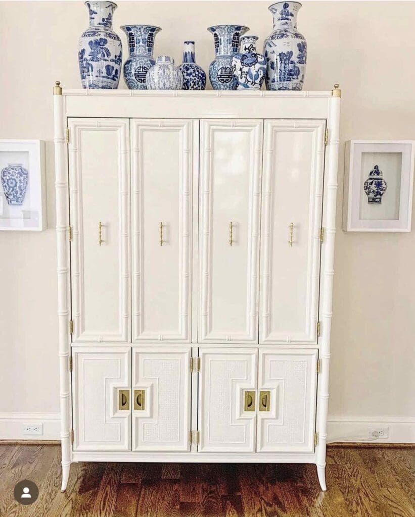
We painted hundreds of pieces of furniture each year, and while I show mostly wild colors, white is the top-selling color for us. Gallon per gallon, white is likely the most popular color for lacquered vintage furniture for us.
Hard to believe, I know. Of course, the wild, colorful furniture stops the scroll, but the soft neutrals are the easiest to incorporate, and I love a few white colors for vintage furniture.
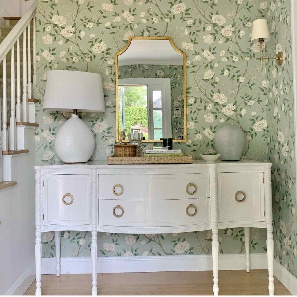
I love soft, warm whites that feel slightly aged to match the age of vintage furniture. I feel that the pretty curves and lovely details of vintage need softer whites. Let’s dive into it!
Benjamin Moore White Dove
My favorite white for my house and furniture. I have painted my entire house in White dove, so my opinion is clouded. White Dove has yellow and black tints in the formula. It is a beautiful creamy white with lots of personality.
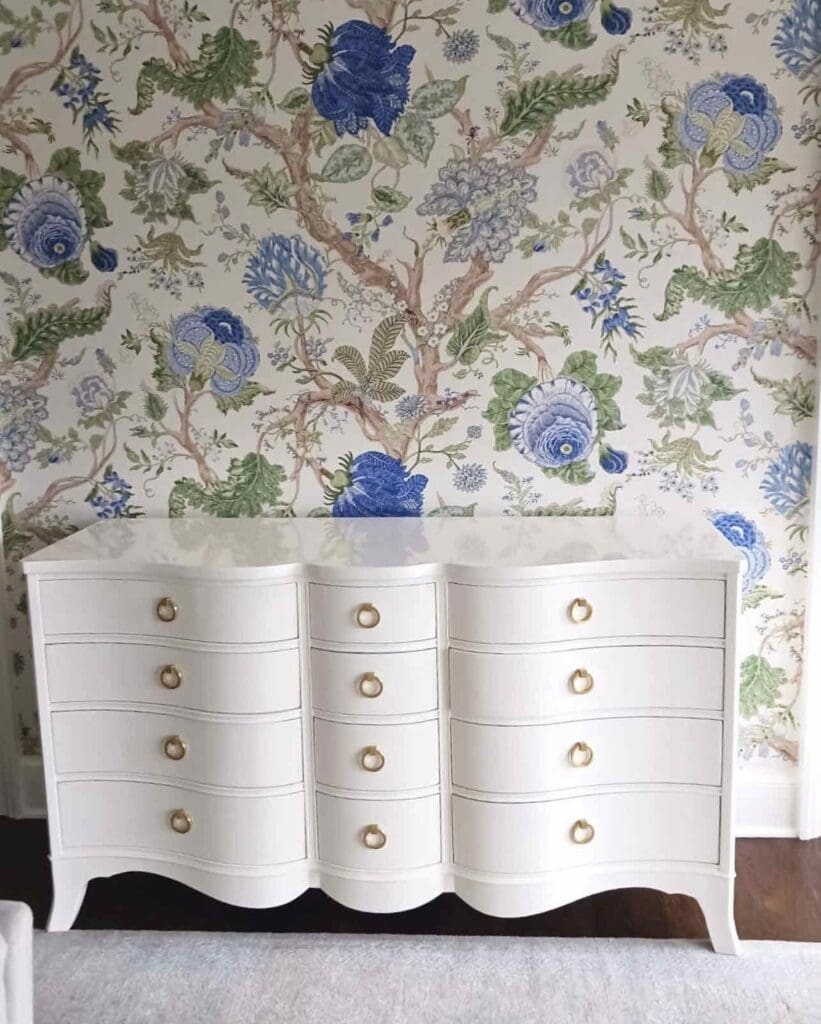
It looks perfect with so many wallpapers that it is my no-brainer, too-tired-to-think white for china cabinets. Look at this china cabinet with Thibaut Honshu wallpaper in the green/cream colorway.
It also looks beautiful with brass hardware, and since I love polished brass, I also reach for White Dove for vintage credenzas and dressers. It makes life easy when I don’t want to (or I can’t) change the hardware on a piece of vintage furniture.
Benjamin Moore Simply White
Simply White is a not-too-warm yet warm white. You can’t call Simply White “creamy,” but it’s also not cold or boring like a white T-shirt.
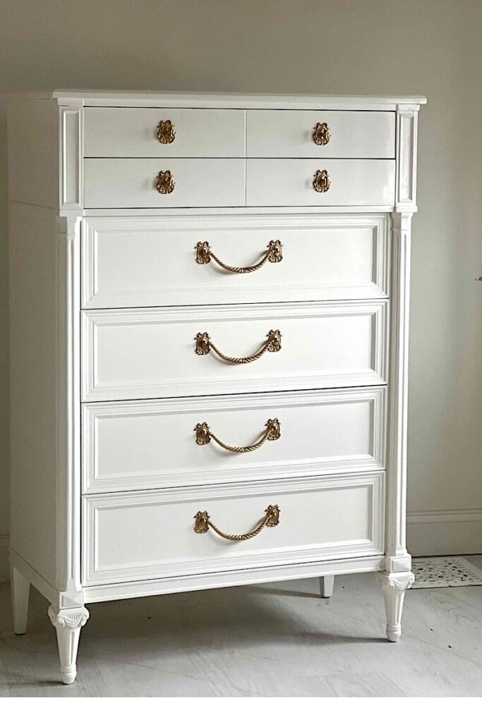
It has just the right amount of yellow tint to warm the color without leaning too much into the vanilla milkshake category. People who don’t like White Dove and find that to be too creamy generally love Simply White.
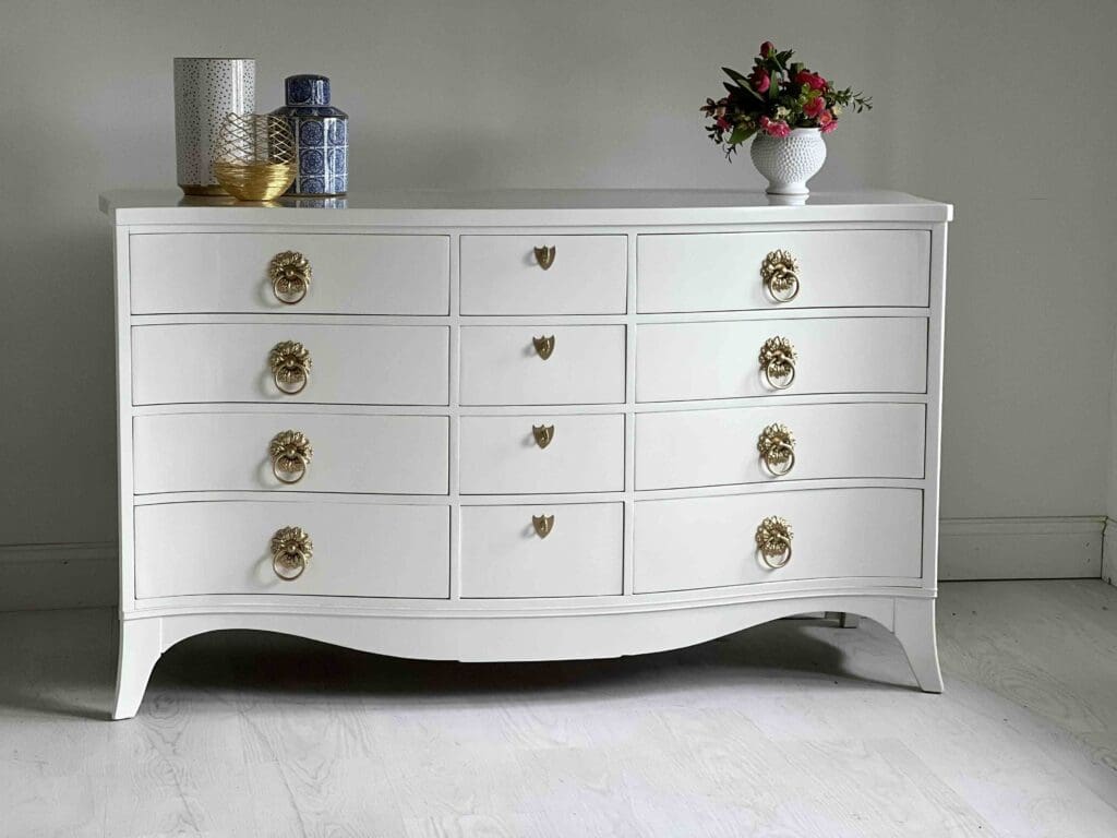
The warmth in the pictures is still distinct and visible (for color-sensitive types like me).
Benjamin Moore Chantilly Lace
If warm white is not your thing, but you also don’t want a cold, boring white, then Ben Moore’s Chantilly Lace is your best white. Chantilly Lace is neutral and bright white; hence, it is one of my favorite white colors for vintage furniture.
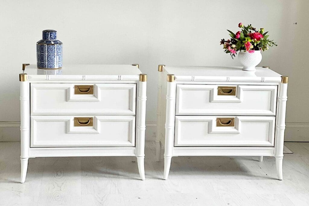
Chantilly has a small, tiny amount of black in the formula, which, believe it or not, brightens up the color. Black tint in a very minuscule quality adds a slight hint of blue. That’s what brightens Chantilly Lace.
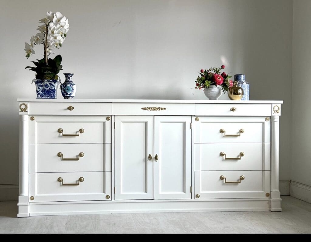
Chantilly Lace is a great white if you want to use polished nickel hardware. The hint of warmth in Chantilly Lace is a perfect match to the hint of warmth in polished nickel.
Sherwin Williams Swiss Coffee
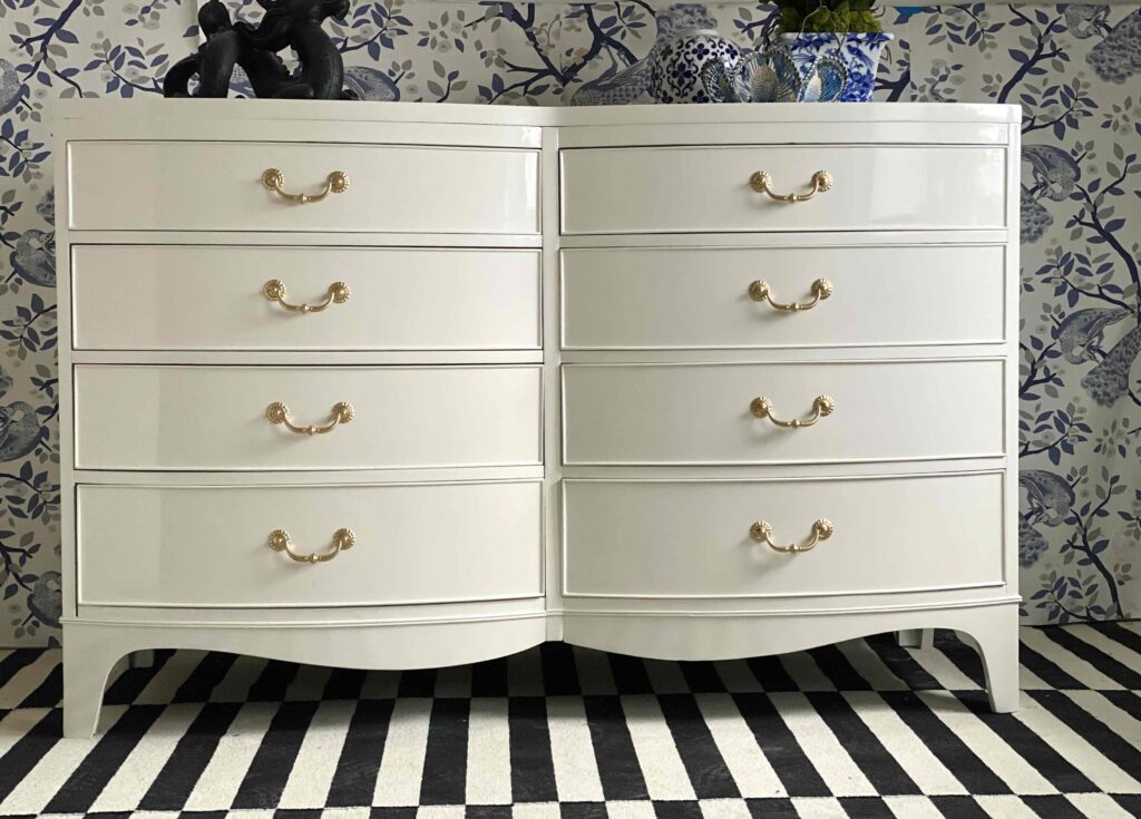
The name is a misnomer. Sherwin Williams’ Swiss Coffee is basically a Swiss coffee is like a cup of creamer with a teaspoon of coffee in it, haha!
It has Burnt Umber as the modifier, which adds a warm brown tint and not a warm yellow tint to the color. Hence, Swiss Coffee is perfect for those who want a creamy white without it looking like an “aged” or “yellowed” white.
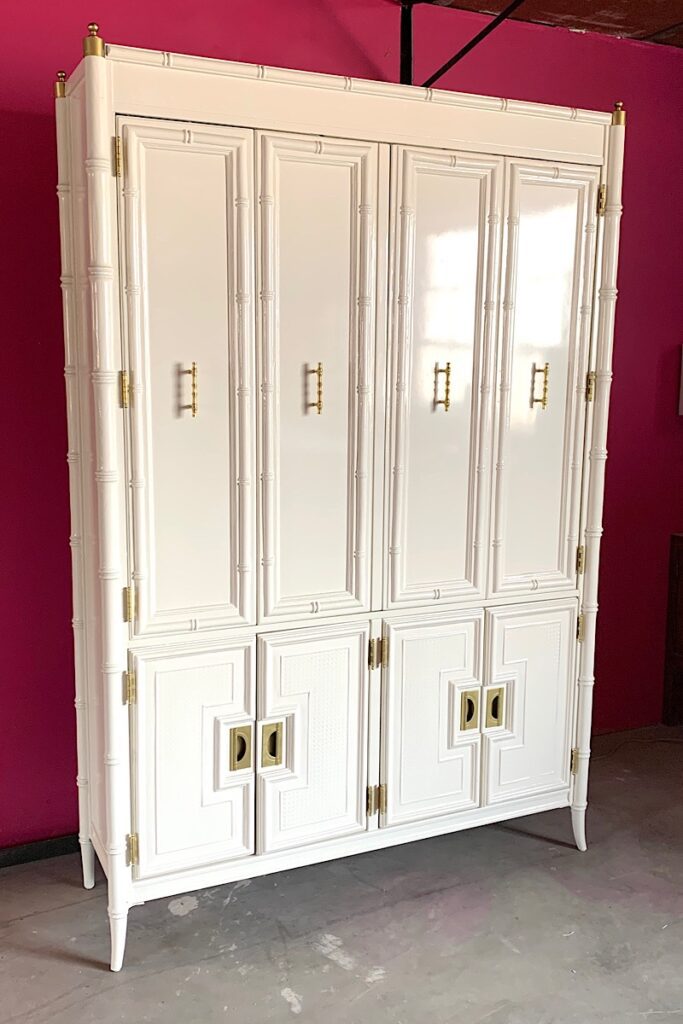
Swiss Coffee is a great choice if you are planning to decorate a space with neutrals and tans, muted blush tones, and many more!
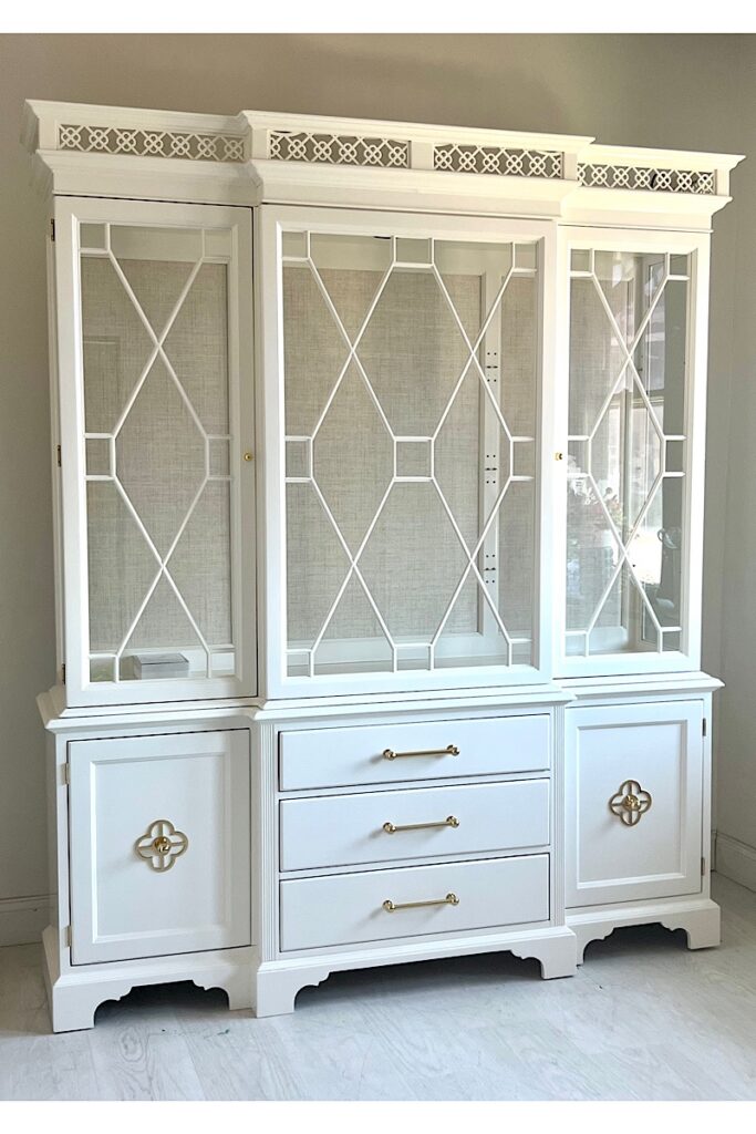
Look at this stunning china cabinet with a grasscloth back. The light tan grasscloth and Swiss Coffee combo is just perfection!
Sherwin Williams Greek Villa
Sherwin Williams Greek Villa is my least used white, even though it’s a very pretty white. Greek villa is the perfect white for grand millennial decor. It has yellow as a modifier so it’s warm, definitely not a neutral white.
This lovely dressing room of designer Amy Studebaker has our Thomasville Tallboy in Greek Villa.
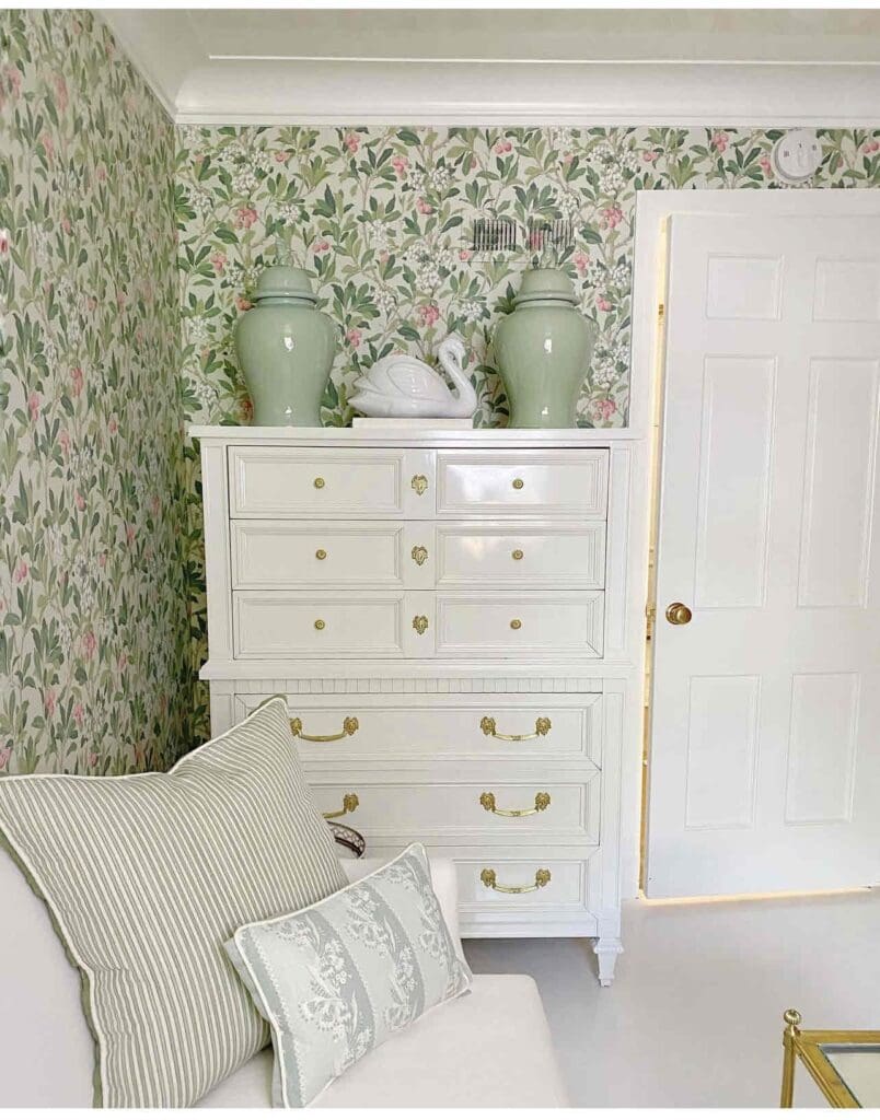
Some people find White Dove to be too gray. They want a distinctly warm white without the gray overcast, and Greek Villa is the perfect white for that.

