
Benjamin Moore Chartreuse is a distinct shade of yellow that combines the invigorating qualities of yellow and green. The color radiates energy and captures attention.
Chartreuse stands out for its boldness and vibrancy. It is an excellent choice for those seeking to infuse their living spaces with a unique and lively atmosphere.
A bold pop of color is an essential element of an exciting, eclectic room.
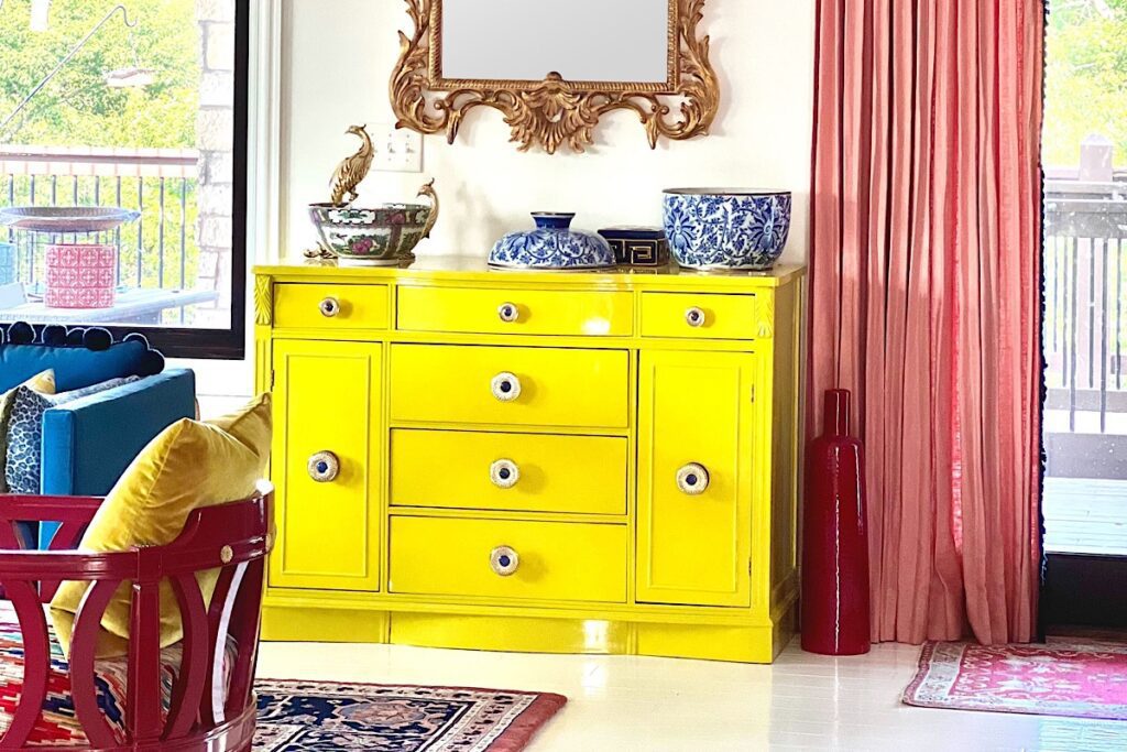
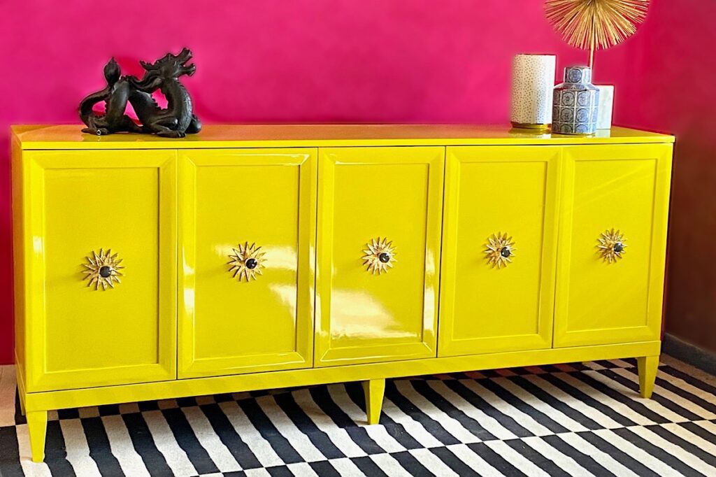
A talented designer in Indiana, Stacy Thompson, introduced this color to me, and I was an instant fan. So much so that I have added it to my own home. Here is the credenza we lacquered in Chartreuse for her.
How To Use Benjamin Moore Chartreuse
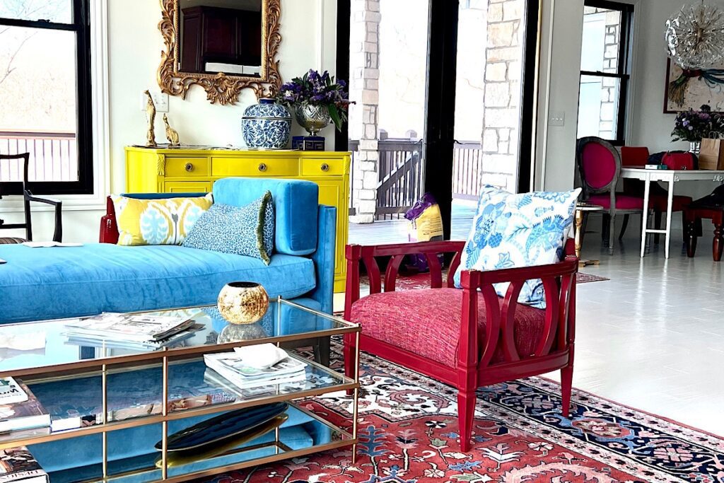
Strategically adding chartreuse as a pop of color creates an instant focal point that enlivens the room. Whether it’s a chartreuse accent wall, standout furniture, or vibrant accessories, it grabs attention and delivers a dynamic visual impact.
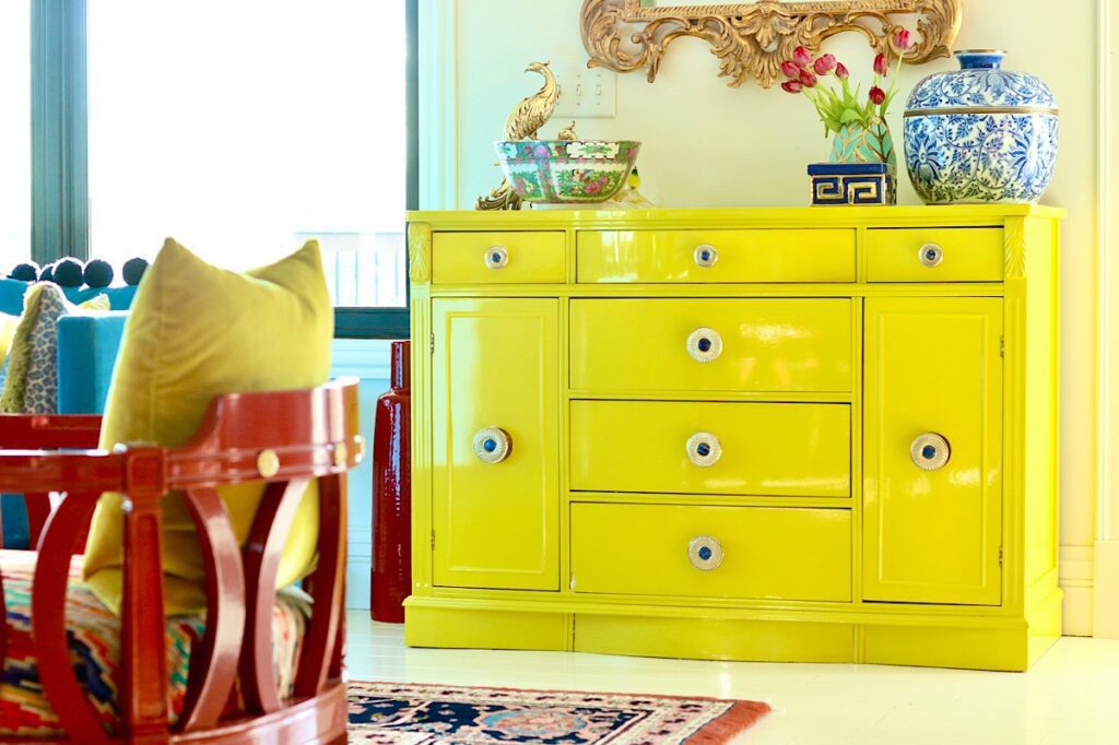
Chartreuse adds a touch of excitement and playfulness to any room it graces. Its brightness creates an invigorating ambiance, making it ideal for spaces where an uplifting and refreshing atmosphere is desired.
I would recommend Benjamin Moore Chartreuse for the following areas.
- A playroom as a color for a storage credenza for toys
- A home office storage credenza or as an accent piece
- A craft room accent wall paint
- A wet bar
The Green Undertones of Ben Moore Chartreuse
The green undertones in chartreuse bring a touch of nature and freshness, evoking a sense of vitality and renewal. This infusion of green adds a harmonious balance to the overall hue, preventing it from being childish or juvenile.
The infusion of green allows chartreuse to seamlessly blend with earthy tones, such as browns and neutrals, creating a harmonious and organic feel.
It can also act as a refreshing contrast when paired with cooler tones like blues or purples, creating a vibrant and dynamic visual composition.
I would recommend using Chartreuse with the following:
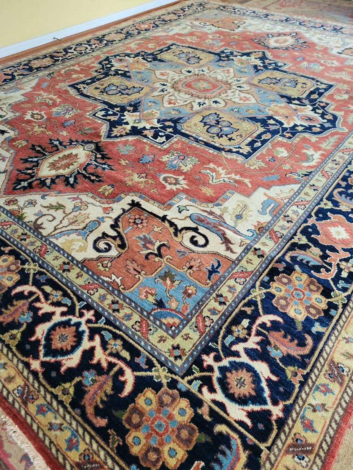
Vintage Design Veg Dye Top Quality Indo Serapi Oversize Area Rug Beautiful Decorative Hand Knotted Unique Design Finest Quality Village Rug For Your Office or Home
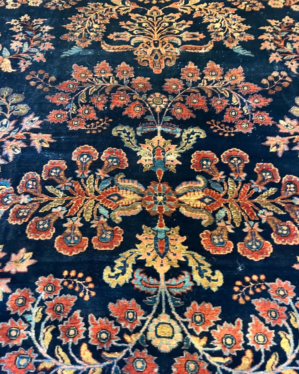
Whether displayed in a grand living room, an opulent study, or a refined dining area, this hand-made wool antique rug becomes the centerpiece of any interior, adding a touch of heritage and elegance.
- Medium to dark blues like this stunning vintage rug in a dark navy blue
- Deep rusty browns like this, a more affordable Afghani rug
- Vibrant purples
- Black and white, like the Ikea rug below
Final Thoughts
Benjamin Moore Chartreuse is a bold, vibrant color. It’s a perfect choice as an accent color. It is striking, rich, and quite unexpected. If you are scared, start with a small pillow or a lamp in a similar shade. It’s a very happy color. You won’t regret adding it to your room.